Logo
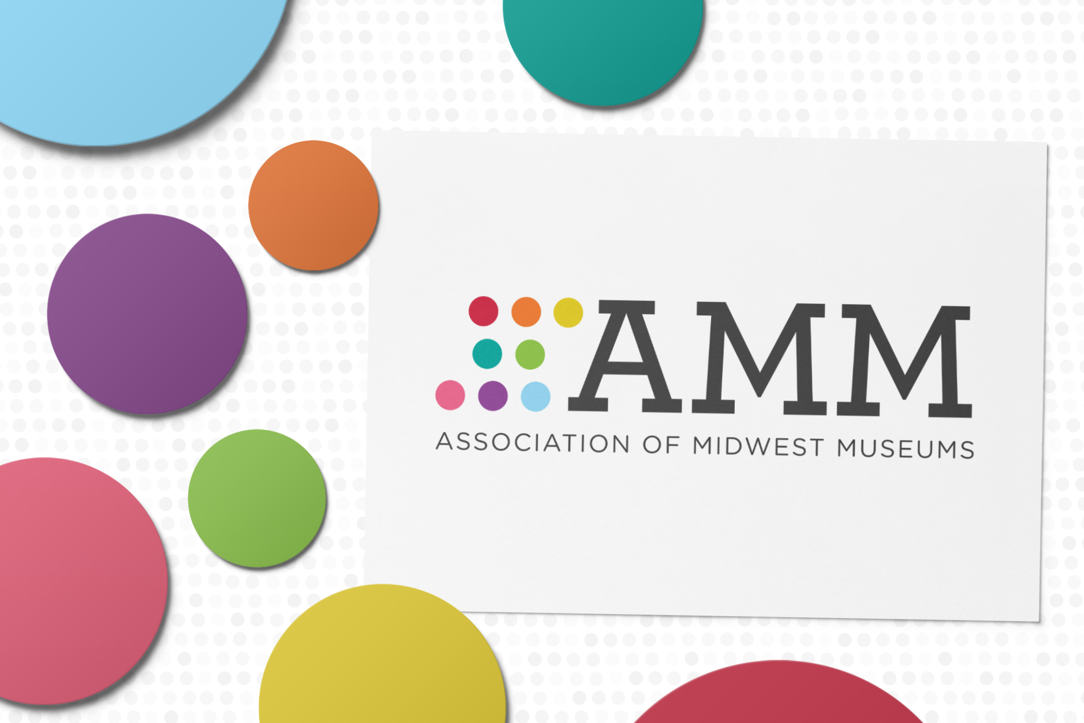
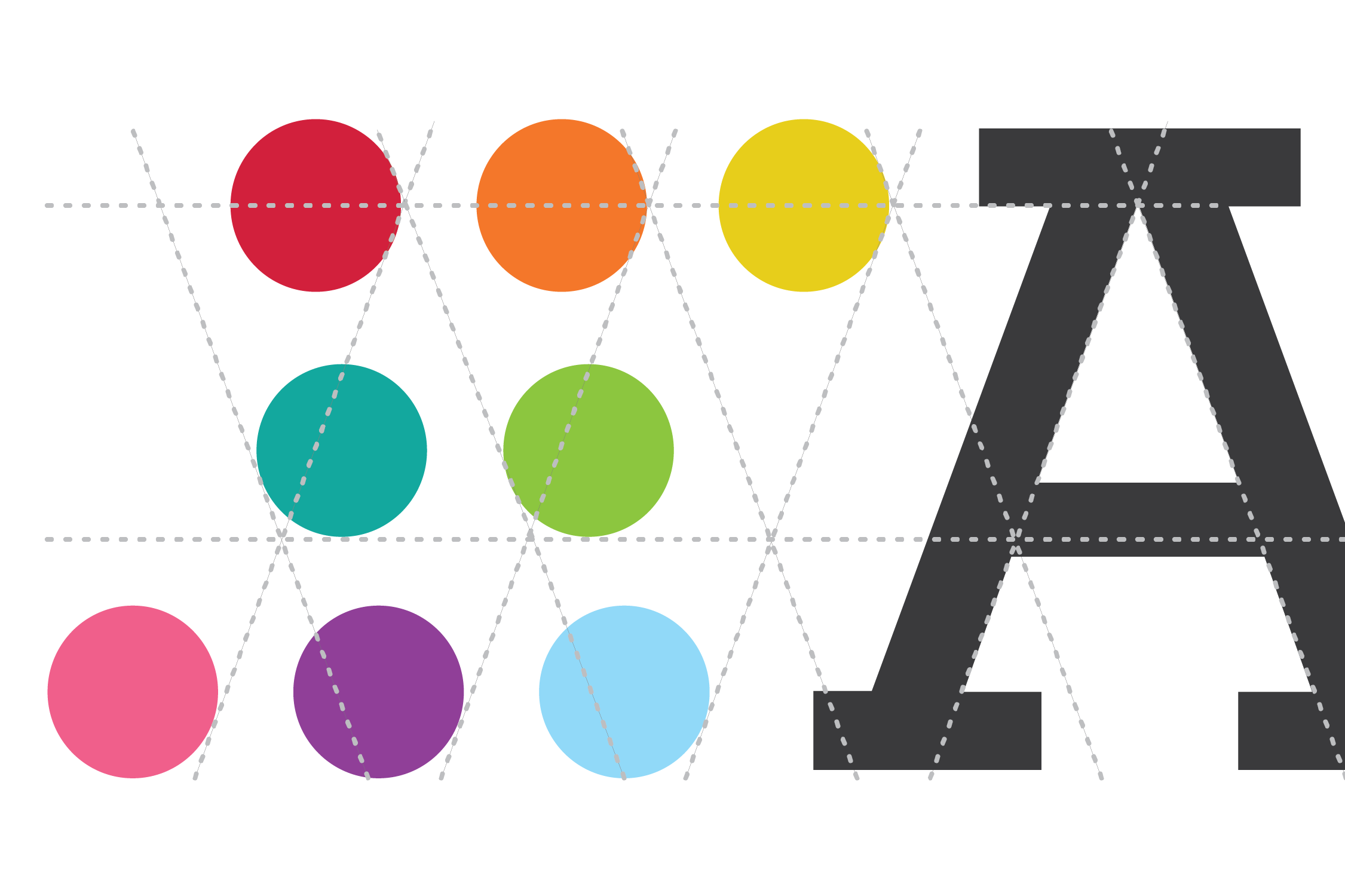
The Association of Midwest Museums is a diverse organization of museum professionals from across eight states, and its members work in a variety of capacities at all types of institutions. This diversity is celebrated by the eight colorful circles preceding the AMM wordmark. This combination allows the logo to be approachable yet professional, speaking to the greater values and mission of the Association.
Colors
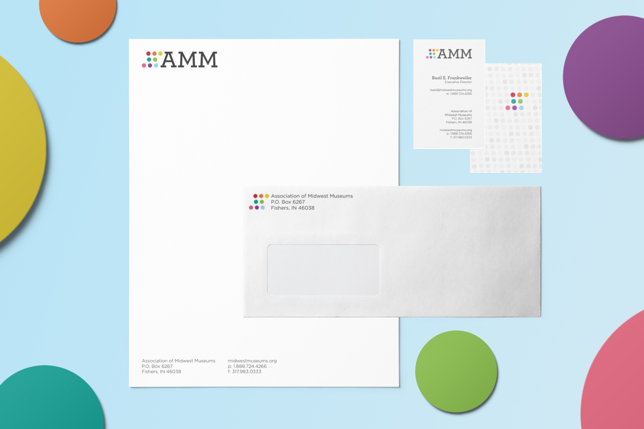
I designed two color palettes to reflect and celebrate the incredible diversity found within AMM. With neutrals to carry information and bright colors to organize it, this wide array of colors represent a vibrant and exciting organization and allows for flexibility as the organization expands programming.
Type
The Archer family, a formal yet friendly serif font, was chosen to convey both the professional and approachable side of AMM. Archer is a joyful typeface and when used to headline text, it sets a tone of enjoyment and inclusivity. Employed for its readability, Gotham Rounded is the everyday typeface for large amounts of text. It delivers information clearly and in the same spirit as Archer, and when used as a pair, the two lock together to create an accessible block of information.
